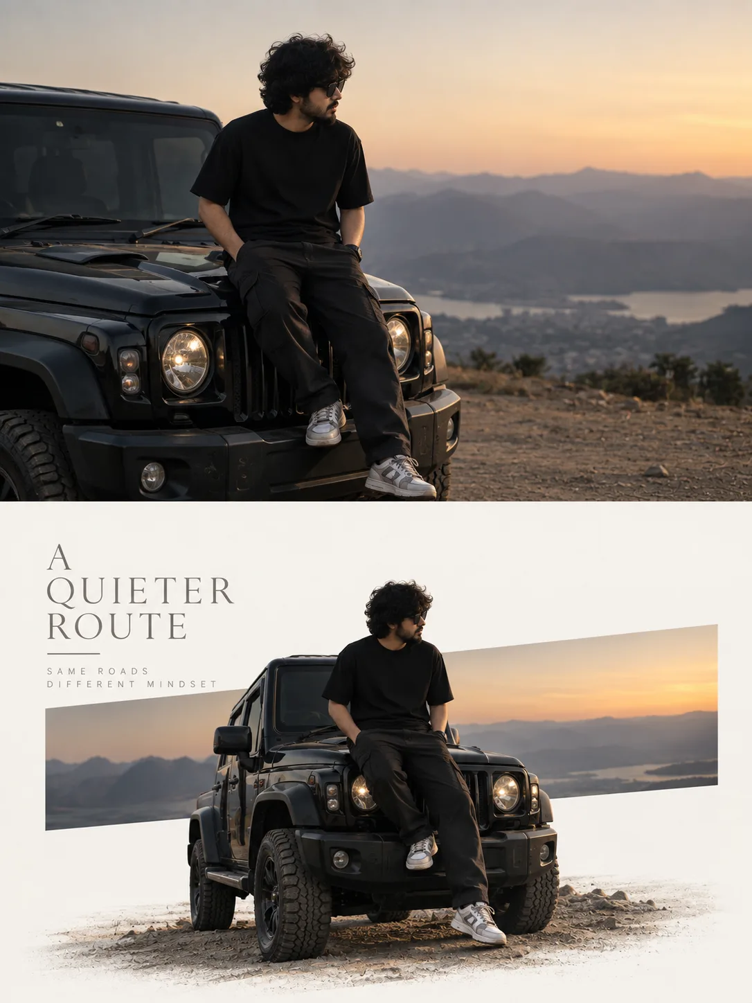
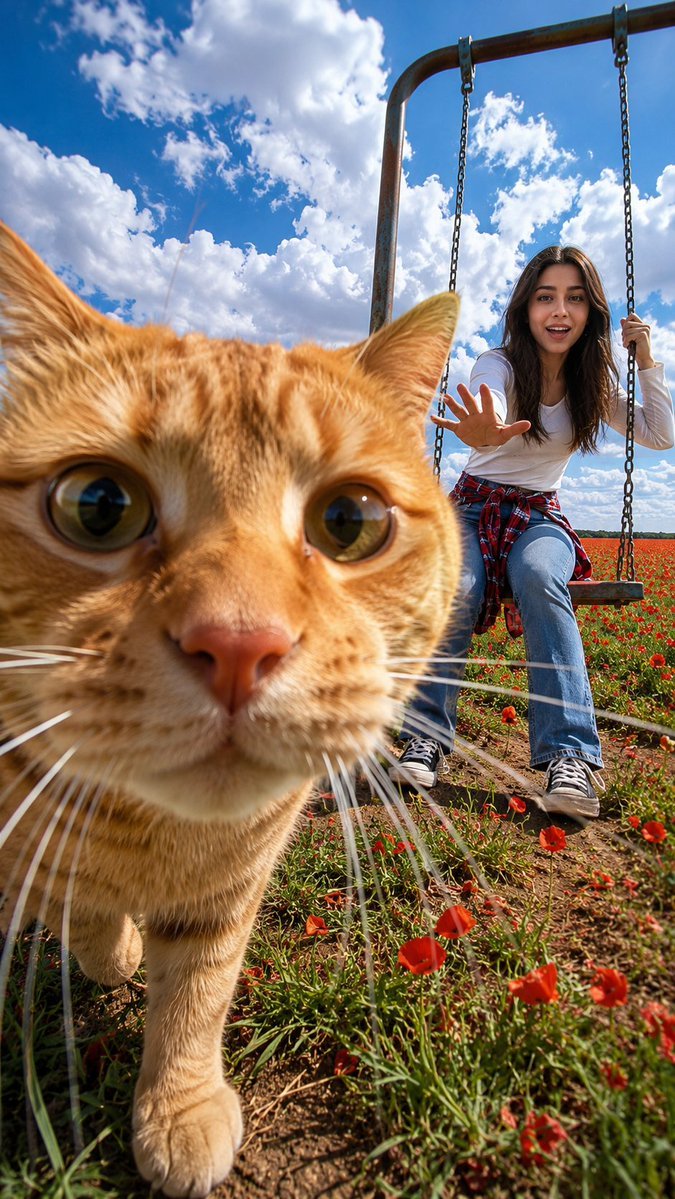
A Quieter Route
来源: @promptzy
这条提示词生成的画面:A Quieter Route。
适用模型:ChatGPT。
可以从提示词确定的画面信息:natural light。
可以改的一个变量:写实 look。
如何使用这条提示词
- 适用模型:ChatGPT。
- 画面主体:A Quieter Route。
- 改一个变量:写实 look。
0 浏览 · 0 复制 · 0 收藏 · 0 讨论
0提示词
今日剩余 1 / 1 次免费复制
Premium Editorial Poster — Original Photo + Narrative Reconstruction

Create a separate, independent premium editorial poster for each uploaded photograph. Do not combine multiple photographs into a collage. Use a strict 3:4 vertical canvas, divided horizontally exactly through the center. The top and bottom sections must each occupy exactly 50% of the canvas height, with equal width and height proportions. Do not alter this ratio.

TOP 50% — ORIGINAL PHOTOGRAPH

Use the original photograph directly. Do not regenerate it. Fully preserve the original: subject identity, human anatomy or architectural structure, proportions and perspective, spatial relationships, materials and textures, natural lighting and shadows, colors and surrounding environment. Only minimal cropping and restrained, high-end photographic color grading are allowed. Do not redraw the subject. Do not introduce artificial lighting, HDR effects, excessive saturation, plastic-looking textures, or fabricated content.

If adaptation to the required aspect ratio is necessary, only extend environmental areas such as the sky, water, ground, walls, vegetation, or distant scenery. Never stretch, distort, reconstruct, or modify the main subject.

BOTTOM 50% — NARRATIVE CORE RECONSTRUCTION

Extract and reconstruct the photograph’s “narrative core.” This may be a single primary subject or a group of related elements that together communicate the photograph’s identity, scale, action, or narrative relationship.

Preserve their realistic and recognizable shape and silhouette, proportions, internal structure, materials, relative positioning. Do not remove important connected elements, and do not use a rectangular cropped section of the original photograph.

The reconstructed subject should generally occupy approximately 55–80% of the width of the lower section. Extend the composition naturally according to the dominant direction of the original photograph. Preserve believable grounding through terrain, waterlines, shadows, or softly dissolving edges so the reconstructed subject feels naturally integrated into the background rather than appearing like a sticker or floating cutout.

GEOMETRIC “THRESHOLD WINDOW”

Behind or through the reconstructed subject, introduce one narrow, low-saturation geometric color field that acts as a visual “threshold window” between reality and editorial abstraction.

Its color must be sampled from the original photograph. Choose a horizontal, vertical, or diagonal orientation according to the visual direction and narrative of the source image.

The subject must actively pass through this window: part of the subject should remain inside the color field while another part extends into the open negative space. The subject should naturally cross the window boundaries, creating overlap, penetration, layering, and spatial depth.

The window is not a frame or card and must never completely contain the subject. Use only one primary window.

Do not use multiple competing color blocks, thick borders, rounded corners, strong gradients, or drop shadows.

BACKGROUND & COMPOSITION

Use white, cool white, very pale gray, or a near-white tone harmonized with the original photograph for the lower-half background.

Create a restrained, asymmetric editorial composition with generous negative space.

Establish a clear three-level visual hierarchy:

1. Reconstructed subject or narrative group
2. Low-saturation geometric threshold window
3. Editorial typography and minimal supporting marks

Supporting marks may only derive from real environmental relationships visible in the original photograph. Keep them extremely subtle and sparse. Do not add decorative symbols, patterns, or graphic elements that have no source in the original image.

TYPOGRAPHY

Use no more than 2–4 text groups: one concise English title, one location or subject label, optionally one short word or reliable annotation.

Do not invent locations, dates, coordinates, statistics, or other data. If information is uncertain, omit it entirely.

Depending on the subject, use either a refined serif typeface or a restrained modern sans-serif. Typography should use light font weights, generous letter spacing, precise alignment, and clean editorial hierarchy.

All text must be spelled correctly. Do not use oversized slogans, dense paragraphs, fabricated issue numbers, logos, or unnecessary additional text.

FINAL AESTHETIC

The final result should resemble a high-end brand campaign, art magazine editorial spread, or contemporary cultural exhibition poster.

Maintain all of the following: strict 3:4 vertical format, exact 50/50 horizontal division, faithful original photograph on top, realistic narrative reconstruction on the bottom, one low-saturation geometric threshold window, a clearly visible subject-through-window relationship, generous controlled negative space, refined and minimal editorial typography.

Avoid any collage-like appearance, hard rectangular photo cutouts, sticker-like elements, distorted subjects, multiple competing focal points, fabricated content, additional color blocks, unnecessary text, logos, and watermarks.
相似提示词
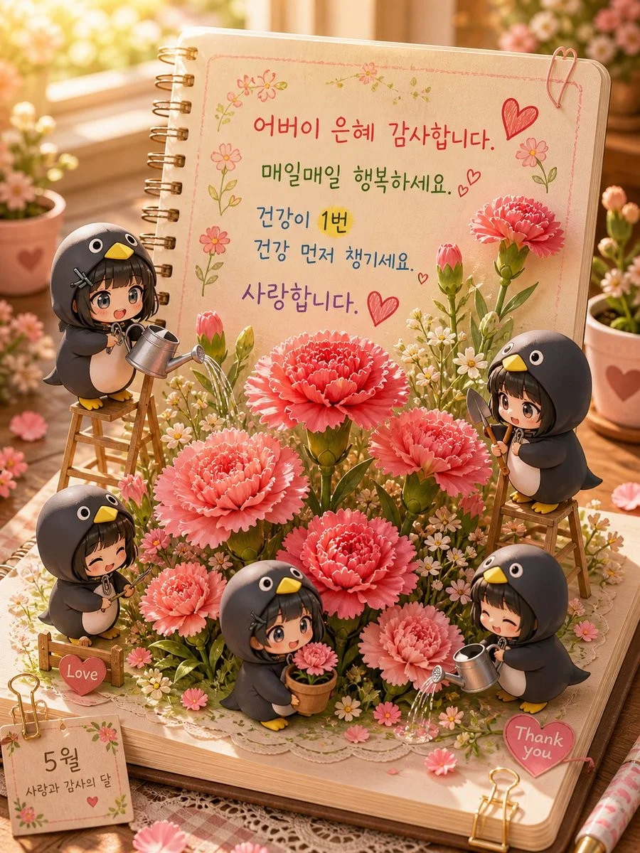
3D Pop-up Parents Day Card
3D 노트 위 꽃이 입체적으로 피어나는 장면, 첨부된 사진의 미니 캐릭터들이 물주고 가꾸는 모습, {argument name="날씨" default="따뜻한 5월 햇살"}, 캐리커처 스타일, 밝고 사랑스러운 분위기, 실제 꽃처럼 디테일하게,
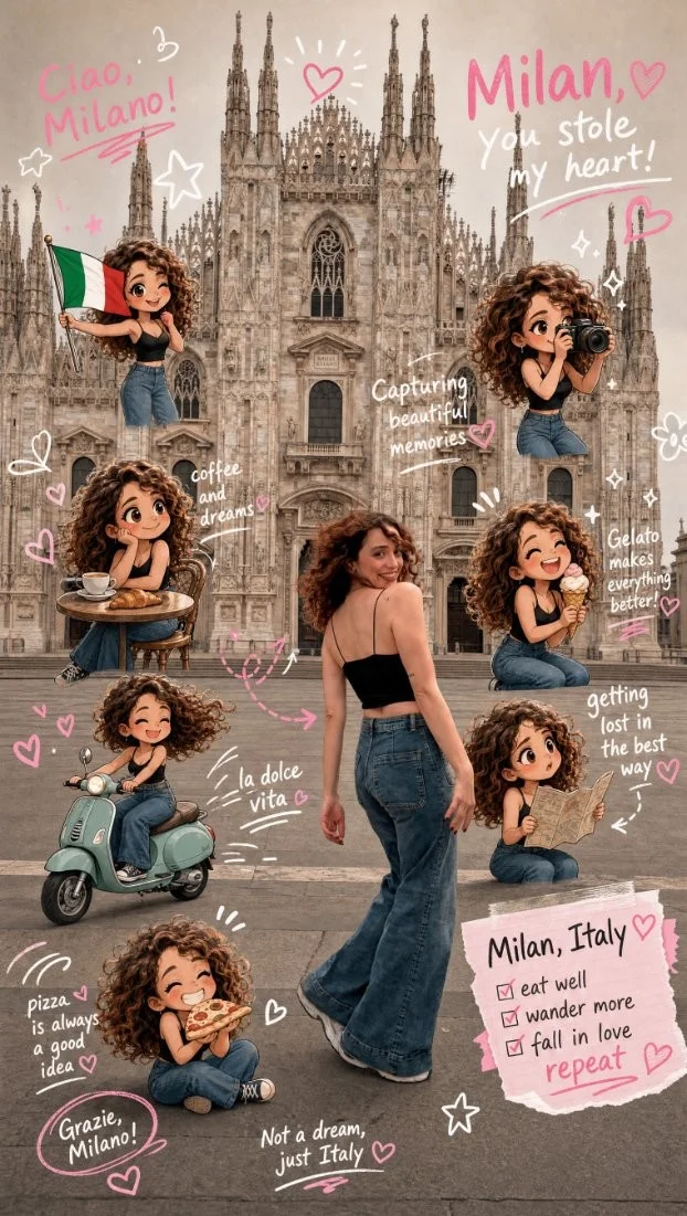
Chibi Scrapbook Photo Transformation
remove the people around the main character, Add multiple small, cute chibi-style “mini versions” of her around the image.
AI Photo Generation Guide
1. Open Gemini / Grok / GPT Image 2.0 2. Upload your photo 3. Copy the prompt 4. Generate 5. Prompt ⤵️ https://t.co/ufvHABxbuM
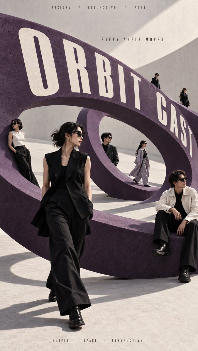
Depth in Image Generation
🤯 Images 2.5 is so good at building depth!
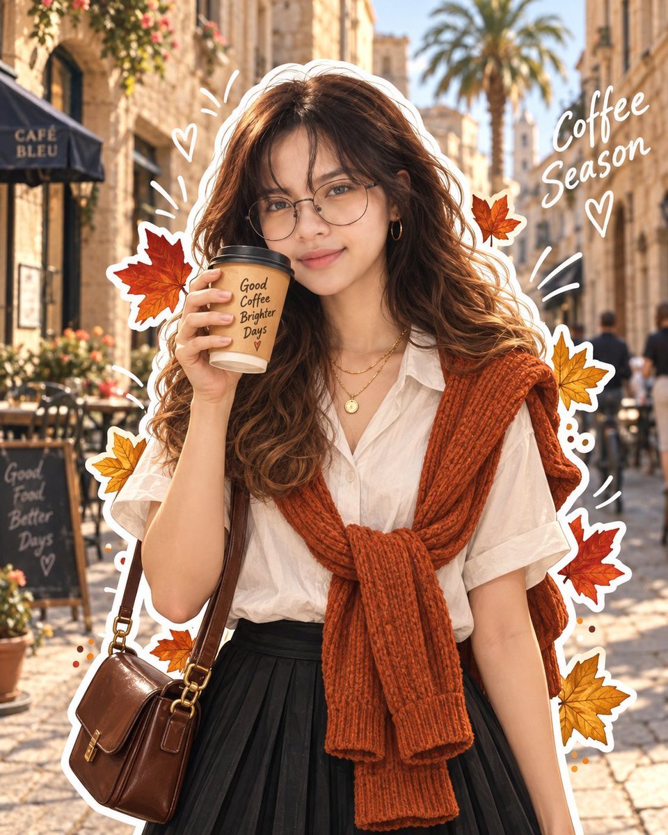
AI Sticker-Cutout Photo Effect
How to get this viral sticker-cutout photo effect with AI GPT image 2 on chatgpt Prompt👇 https://t.co/Re6oPaU3zv
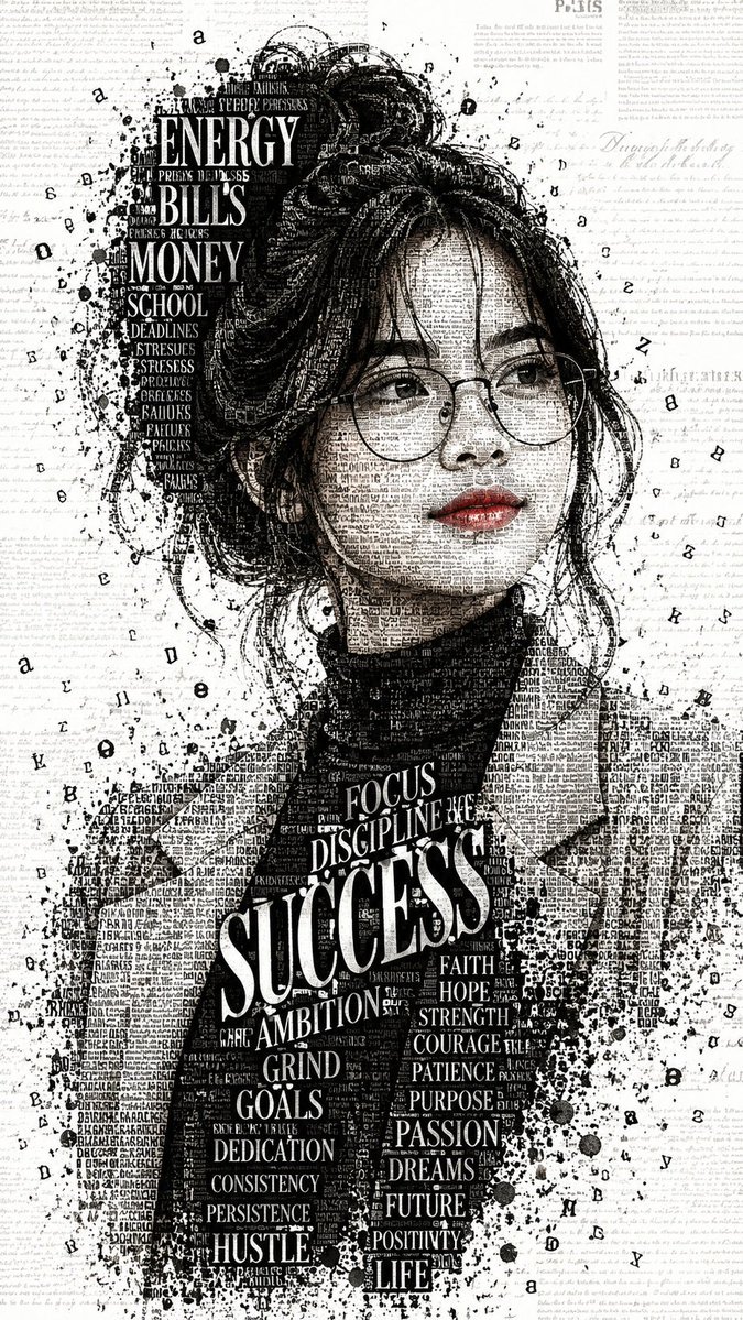
Photo made of words
Your photo, but made entirely from words 🤯👇 ① Open Gemini / Grok / GPT Image 2.0 ② Add your photo ③ Paste the prompt ④ Generate.
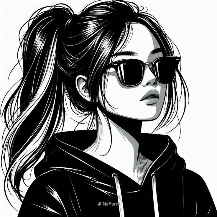
Photo to Hand-Drawn Art
Turn your photo into a hand-drawn masterpiece ✍️🖤 ① Upload your photo ② Copy this prompt ③ Generate ④ Done.
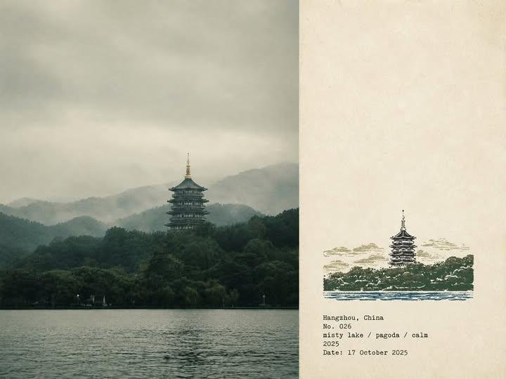
Rubber Stamp Travel Field Notes Poster
GPT image 2 on chatgpt Prompt👇 Please create a separate "Rubber Stamp Travel Field Notes Poster" for each photo I upload, outputting each
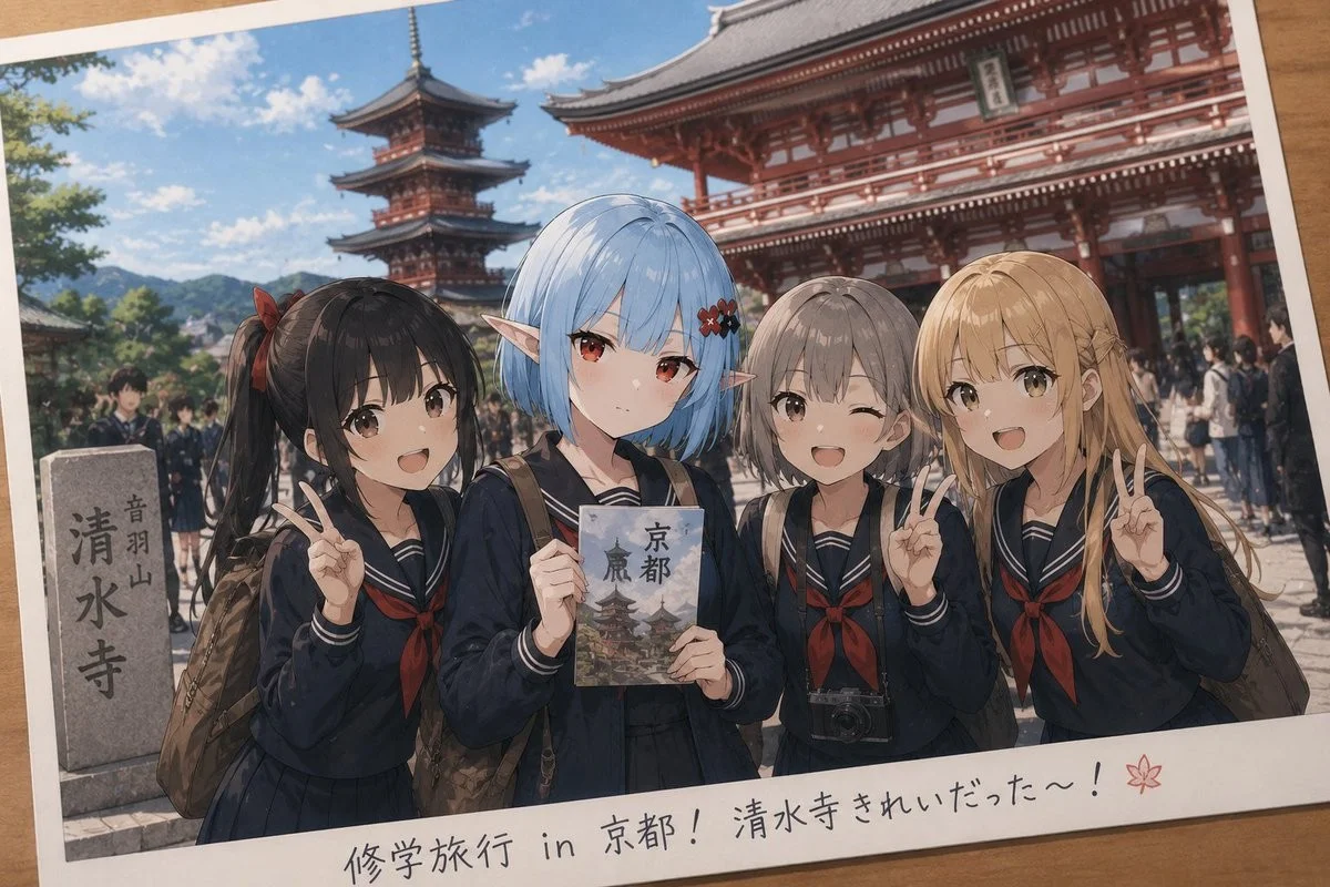
Event Photo Synthesis Illustration
Generate a single illustration based on the school trip photos.
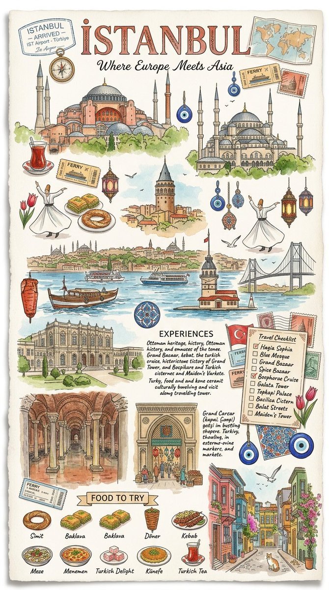
Istanbul Travel Journal Collage
Image created on Gpt 2 Prompt: Ultra-realistic hand-painted watercolor travel collage with soft ink outlines, vintage travel journal
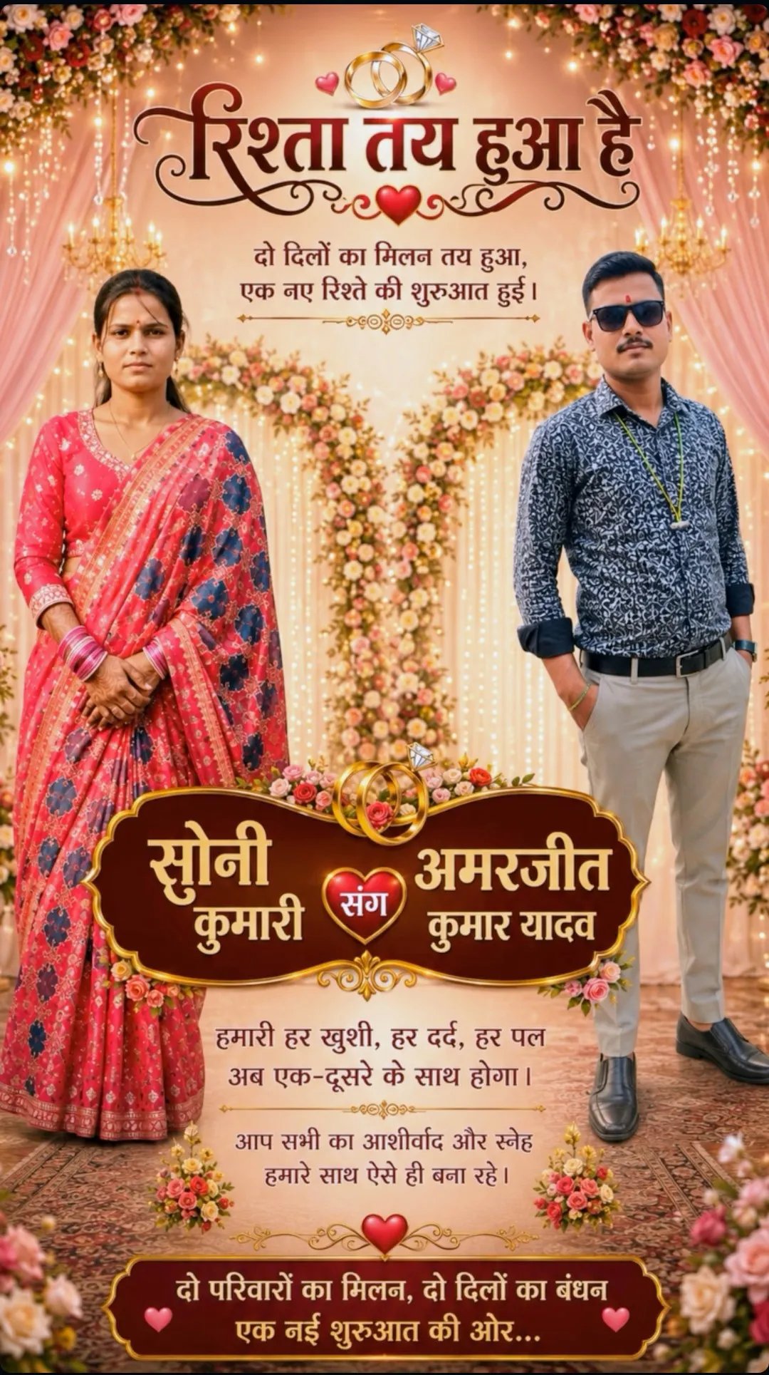
Indian Wedding Invitation Card
"एक भव्य भारतीय डिजिटल वेडिंग इनविटेशन कार्ड (Digital Wedding Invitation Card)। बैकग्राउंड में हल्के गुलाबी और सुनहरे रंग के पर्दे
Cat Ruins Photo
GPT Image 2 on ChatGPT Prompt: Use the uploaded reference image as the primary facial reference.